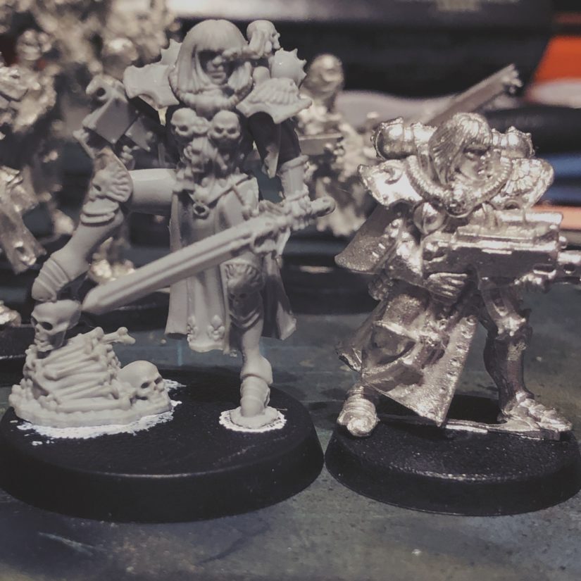
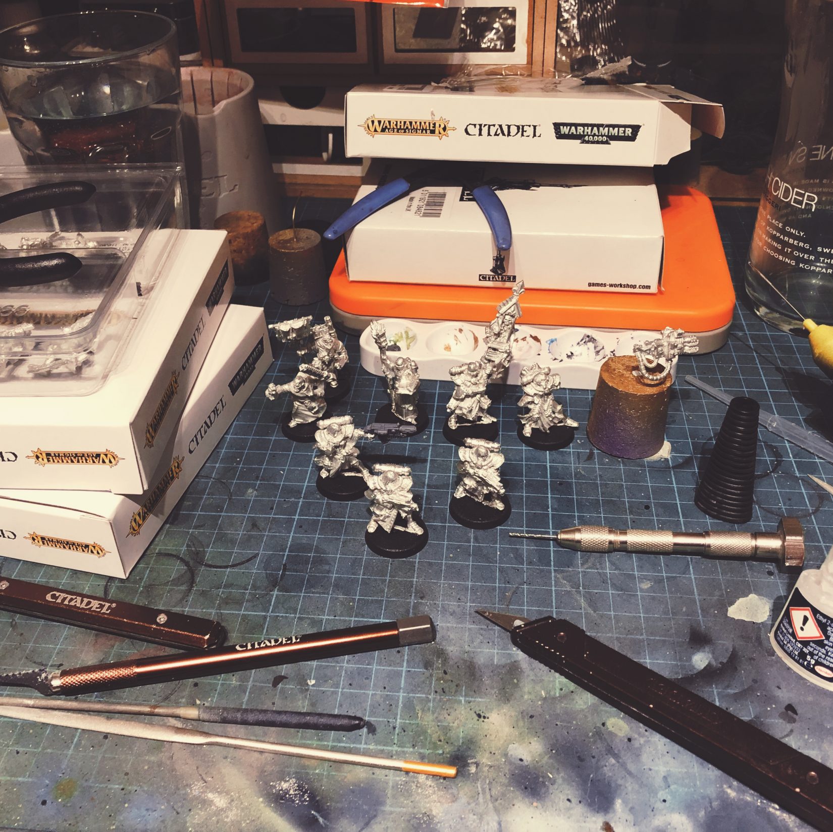
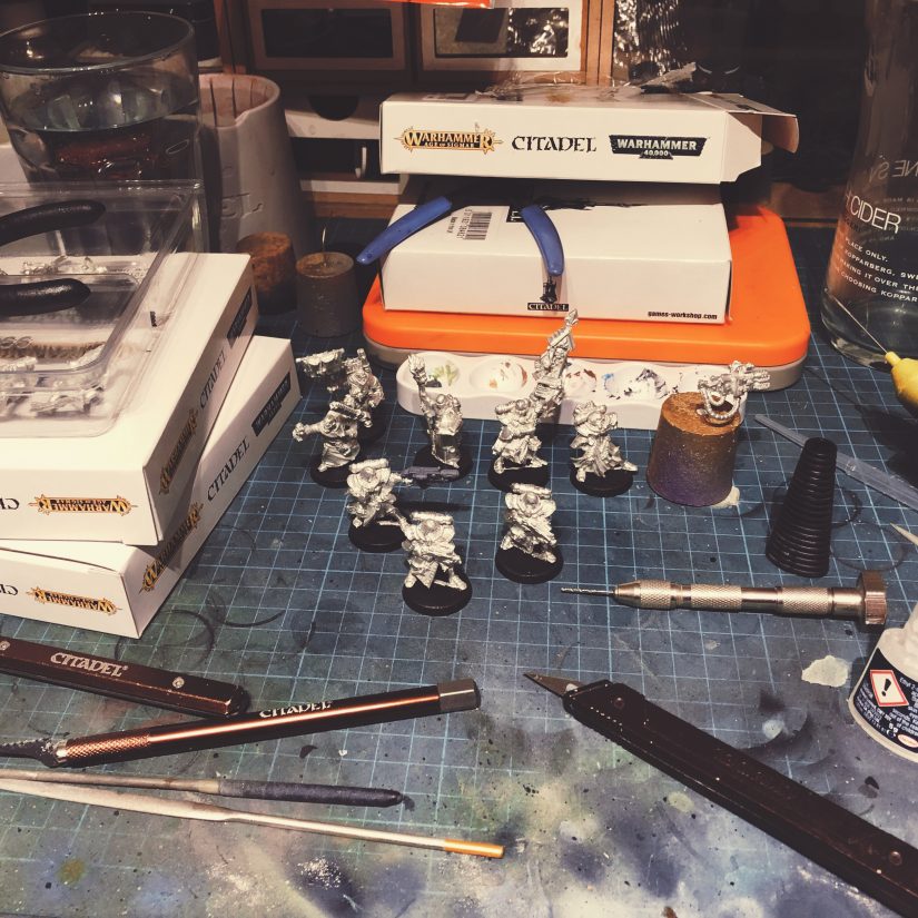
I had no idea the Canoness Veridyan model was so much bigger than the original Sisters. Even discounting her ridiculous heels, she’s a good head taller than the others. It makes me worry about how well the plastic kit will blend in alongside the old #PrimarisSistersConfirmed
“Bodoni* is the first ever no-compromises Bodoni family, built for the digital age. Years in the making, this font family includes a whopping 56 font files, ensuring you will have the perfect Bodoni for every situation.”
I added myself and this site the the IndieWeb wiki WordPress Examples page earlier. It felt a little narcissistic, if I’m honest!
I’ve not added K to the WordPress Themes page for now, as I don’t think it’s ready yet, but I’ll add it in due time (or let others judge it worthy of inclusion).
“Learn how to build blocks and extend the editor, best practices for designing block interfaces, and how to create themes that make the most of the new features Gutenberg provides.”
“I owe much of my career to View Source. It’s what got me started with web development in the first place. Going to sites that I liked, learning how they did what they did. Yes, I also bought a bunch of animal books from O’Reilly, and I read WIRED’s Webmonkey, and the web was full of tutorials even then. But it’s not the same. Seeing how something real is built puts the individual pieces of the puzzle together in a way that sample code or abstract lessons just don’t.”
I love View Source. I still use it daily. I’m not a person who builds sites in JavaScript – that’s never really been my thing. I love to craft in HTML. I get annoyed when I can’t alter or overwrite the output HTML of a WordPress function or plugin, and have been known to reimplement it myself if necessary.
Right now, K is a lot messier under the hood than I’d like. Once things are a bit more defined I intend to go back and clean it up so the output source is as readable as possible (proper and consistent indenting and the like), and the structure is better from a POSH point of view.
Shared to IndieWeb.xyz.
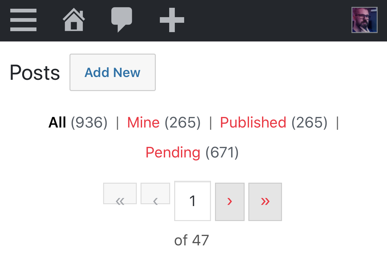
I implemented proper pagination between archive pages last night, which should help making getting around the site slightly easier. I still need to implement pagination for pages/posts that are split into distinct pages. I’m not going to implement comment pagination, because I don’t like it.
Alongside this, I’ve added some templates for archive pages and search results. There’s nothing much to these, but it does give me flexibility to give these their own special formatting if I want to.
I need to come up with a better archive page than the current “Sitemap”. The current “design” was inspired by the archive page on Daring Fireball. It works fine if you’re only posting a couple of items a week, but in January I posted 112 items1. I’ll probably keep the sitemap for discoverability purposes, but a more friendly archive page has been added to the todo list.
- That’s almost twice the previous high water mark of August 2018. ↩
“Apple decided several years ago to produce a high-end Mac in Texas. The problems that surfaced illustrate the challenges of domestic manufacturing.”
