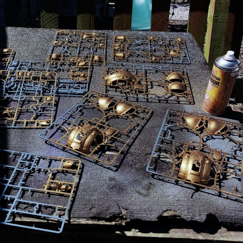
I’m making use of the nice weather and my long weekend to try and finish off the 3 Knights I started in… *checks photo library* … November.
Reposting: Quoted You need your own spot! by Leo Laporte (This Week in Google | TWIT.tv)
Everybody, every company, ought to have a website: a place they can call their own, a place where your best stuff lives, a place where, when people Google you, they find your site.
“Well, with the launch of a new charity army being mooted by @vidpui and @nerodine , I thought this might be a really good time to go through everything I learned by doing the Salamanders Charity Raffle back in 2015. I’ve mentioned some of this on Twitter recently, but going through it step by s…”
“I attended a seminar on the science behind the new Contrast Paints and between that and what I saw (and experienced) today, I’d like to share as much of it with you as possible. At the moment information is a little light on the ground (though that is sure to change in the coming weeks leading up to their release), so I hope this can be your one-stop shop for getting up to speed on Citadel’s new paint system.”
I can’t wait to try these paints. I have acquired a large backlog of miniatures I don’t care enough about to paint with the long-winded “traditional” method, so having something I can use to churn out entire units in a few hours will help me get them out of the cupboard and usable in games.
These will share a similar fate. I was just slightly perturbed that they’re directly targetting me. My partner hasn’t had any mailed to her, and apparently many of her friends are the same – their (male) partners have received the same leaflets as me, but they haven’t. Lucky them!
Someone suggested this to me offline, and I’ve definitely been thinking about it… it’s just the right level of petty ?
““@MstrKapowski Send them GDPR requests…about where they got your data from, watch them scramble to not get the info to you in time and thenreport them so they get fined! It’s what I’m doing! #theEUstrikesback””
I’ve taken the decision to switch my site away from the custom theme called “K” I was building, and for now I’m using the excellent Autonomie by Matthias Pfefferle instead1. Development of K had already slowed to a standstill, and realistically, I’m not going to go back to it anytime soon. It feels a little like a failure, a little like giving up, but I think it’s ultimately the right thing to do.
I made a lot of mistakes while building K, which overcomplicated things, made development more difficult, and ultimately led me into a dead-end. I thought “for simplicity” that I would use the Bootstrap frontend framework, as it would give me a robust foundation to build on. It did, but I had to bend and twist WordPress in increasingly hacky ways to get the output to “play nice.” A large chunk of the K codebase was being taken up by code solely tasked with massaging the output of WordPress to add the right Bootstrap classes or container markup. It felt increasingly fragile and hacky, and it was a bad sign. K would work for my setup, but I couldn’t ensure it would work for everyone.
Bootstrap added other complications: to properly manage my CSS “overrides” I had to create a build system that would compile a whole lot of SASS files together. When I started K, the CSS was stripped down to the bare minimum needed, and came to a few KB. After a while I ended up including the whole Bootstrap framework, just to make the build process easier.
There were no “options” to speak of, so it couldn’t be tailored to suit someone else using the WordPress customiser. I didn’t even want to think about Gutenberg support.
Microformats always felt like whack-a-mole. I’d get them working, then make adjustments somewhere else, and promptly see things break again. I put this on my need to make so many adjustments to the WordPress output – inadvertant issues kept creeping in.
Then there were the visual design choices. K grew out of the simple design I employed when I was writing 1-2 short posts a month, in the traditional format. In that scenario it worked fine. Once I started to use the various post kinds, things became more problematic. Now I was posting several posts per day, most of which weren’t in a traditional blog format. The home page became cluttered; it started to remind me of a badly thought-out notification area, rather than a well designed blog. The archive page was a disaster and I had no good ideas on how to fix it. There were a thousand other little niggles.
None of this is meant as a knock against Bootstrap, or WordPress, or build systems, or any other tool or technology I used to get to this point. K failed because of my decisions, rather than deficiencies in the tools. There were things I liked about K… it used zero JavaScript, and I did my best to stop unnecessary plugin resources from loading. Markup was as minimal as I could make it (within the constraints of what I could remove from WordPress output, microformats, and what Bootstrap needed). It worked well across browsers and devices (thanks Bootstrap!), and the accent colours were fun. I learned a lot about the excellent Post Kinds plugin during the development process. I’m filing it away as a failed experiment, which I’ll learn from and apply the lessons to the IndieWeb WordPress theme I’m still intending to create. One that will hopefully work for more people than just me ?
I put the source code to K on GitHub right back near the start of the project. If you want to take a look, steal any code, rework it into something usable – feel more than welcome to!
1 As a result, a couple of things that were setup specifically for K are broken. I’ll look into fixing those over the next few days. ⤴️
“”Soph” has nearly a million followers on the giant video platform. The site’s executives only have themselves to blame.”
?♂
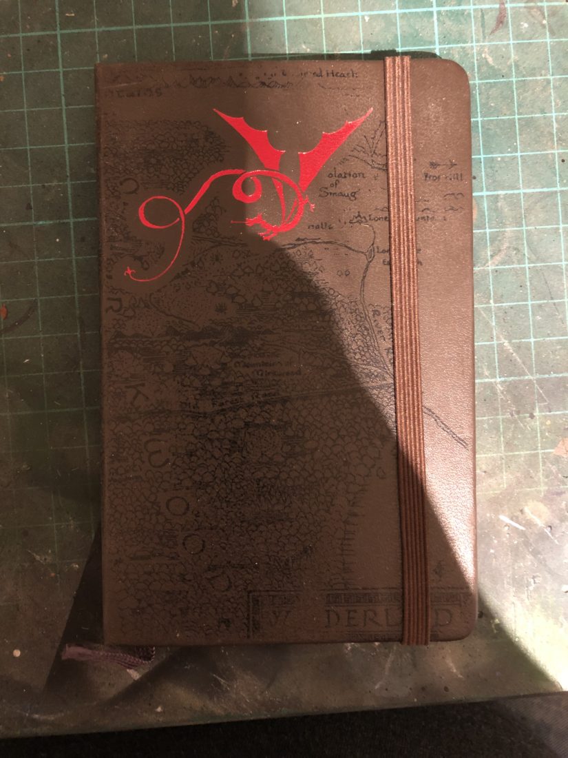
I found this Hobbit-themed notebook while I was clearing my hobby space, and it triggered a few memories. It was a Christmas gift from several years ago, when I was in quite a different place in my life. I keep meaning to get in the habit of taking notes, but for some reason it never sticks. I’ve probably got more half-used notebooks than pairs of socks! There are several pages torn out of the front – I wonder what was on them?


